|
|
Post by Wizard♦ on Mar 7, 2015 7:49:17 GMT -8
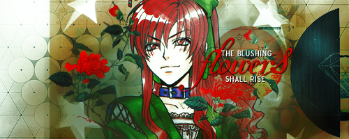
What do you think? I made it for my new hunter x hunter site... Two Kings and I really like it. I think it could have been done better but I don't know what it is missing. I would love some positive feed back to maybe make it look better. Full image |
|
|
|
Post by SEADRA on Mar 28, 2015 9:17:32 GMT -8
Is this supposed to be for a banner? I'm assuming yes b/c of the full size so I'll critique based on that~
The 3D thing is really sick and I've always really liked it personally, but I would blur the actual dood slightly less because it low-key makes me a little dizzy - it's the 3D interfering with the guy on the image - + if you're going to use it as a banner you need to be able to stare at it for long periods of time without getting a headache. So lightly less blur - otherwise I love your image selection. Like +++
I'm assuming you'll probably add text manually in coding?
Also, I would either leave it plain and simple with the text as the focus, maybe imitating the 3D effect as a hover or something, or I would add some textures or brushes behind the guy to make it a little more visually interesting. That may turn out cool or not depending on what textures/brushes you have. I do really like the concept of your image! It fits the theme pretty well (idk the guy may be from the series i honestly have no idea lmao) and is just (Y)
|
|
|
|
Post by Jacob on Mar 28, 2015 11:32:47 GMT -8
I concur with SEADRA. The effect done upon the man is excellent, but you might try placing a stable version of him in the center. After that is done, copy and paste that layer, then blur it; move it out to the left enough to leave the male generally visible; repeat the process, except pull the copied layer and go to the right. Erasing the middle partially with a soft brush, then fading the blurred remnants instead of taking the eraser again may help. This example was made when I was a teenager, but: Kyogre. Study the boy sitting off slightly. I think you could apply the 3-D effects to the man in your own banner in a similar fashion. Upon finishing that, the signature, I assume is going to use a darkly "masculine" theme. The leftover gray leaves everything a tad lackluster. You'll fiddle to acquire self-taste, but grungy and even cloudy textures set on "Darken," "Lighten," or "Screen" might work. Another sample of mine is: Neko. (Ignore the lyrics; I mimicked someone else's.) Aditonally: Simplistic and Sakura. These should clarify my suggestions. Text can be placed behind the upper half of the graphic, yet on either side of the shoulders and head likewise; or, you could write whatever separately on the forefront. I am personally reminded of the fourth banner I linked. A white script foundation is my own thought. Afterward, perhaps add a subtle coloring to balance the ultimate result out. SEADRA is unequivocally correct; you'll be doing much experimenting. What has been presented already looks great thus far! |
|


 Five years ago, the Pokemon League formed Lux to create a new world order of peace and harmony. A rebellion formed, under the name of Nox, cries tyranny at Lux's new microcosmic control. Their civil war now tears the Pokemon world apart. The world hangs in the balance of predormitum. Which side will you choose?
 is a high stakes RP set in a dystopian Russian society recovering from an apocalyptic war between the armies of Heaven and Hell. Greater Russia now stands free from the influence of God and the Devil, and all non-humans run the risk of execution. Outside the safe zones lies the contained wasteland of Moscow, where demons and mutated shadowbeasts continue to terrorize the remaining human survivors who have been penned in with them. As of late, increasing evangelic disturbances threaten the peace that has ruthlessly maintained by the secret police.