|
|
Post by Ginger on Mar 16, 2015 18:52:11 GMT -8
How much information do you like on them?
Do you like hovers?
How tall or wide do you prefer the miniprofile?
What have you seen that seems pretty cool, that has been on miniprofiles?
What do you enjoy/hate about them?
-if you can think of anymore questions/information please add it in your comment-
|
|
|
|
Post by PHARAOH LEAP on Mar 16, 2015 19:27:31 GMT -8
Just gonna pop in here with my personal mini-profile preferences. ;D
information;; This partially depends on the site, seeing as sometimes a bit of information that would be trivial on one can be crucial on another. Generally speaking, though, mini-profiles should be more than just the bare-bone minimum you get at the start. An application link as well as the RPer of the character should almost always be included on sites that work by an account-per-character system, and I almost view them as important as the group name and account name. Stuff like "gender" and "age" doesn't necessarily need to be added and should only be used to take up possible blank space. I do, however, love a portion for the personal status, and mini-profiles without them make me sad. *stares longingly at GS mini-profile*
hovers;; When used in creative and interesting ways, absolutely. I love hovers in any form, so hovers on a mini-profile are great... if they stick out. Now that the code for hover mini-profiles have been released, they're so common place that sometimes I get a little bored hovering over them; finding cool things to do with them like transition delays or information flying in from different sides keeps an idea that's growing old fresh. Too long a delay or transition duration, however, can be tedious, so you want to keep how long the hover lasts short.
height/width;; Little preference. I only have to comment that skinny forums should not have wide mini-profiles, while wider forums should take up more space horizontally to balance it out. If you're using a hover, stick with the 200x300 image size; most people have pre-cropped images for that if they're recycling face claims, and cropping new images for each sites' mini-profile can get really tedious really fast. Aside from that, as long as you're utilizing your space properly, any size should do. I'd just say don't go over 300 pixels of width, unless you're doing a horizontal mini-profile.
cool stuff;; Transition delays are cool, but I'm afraid that if too many people use 'em, they might start to get bland like the general mini-hovers. Horizontal mini-profiles, when done right, look really stinkin' cool, and actually provide much more space since you have the whole width of the board to work with. Aside from that, I like mini-profiles that go outside the wrapper (though it can be kind of a pain to achieve), and good ol' mini-profiles without hovers.
enjoy/hate about 'em;; I'd say the only things I hate about them are: 1) how boring they can get when a certain effect is done too many times, and 2) how personal messages slaughter certain things about them. T^T I dunno, though; I guess I like that they're a helpful little insight to characters done in (usually) creative and pretty ways? Mini-profiles are just generally cool. |
|
gloria luciferis in excelsis
|
Post by THE LEVIATHAN on Mar 18, 2015 10:47:26 GMT -8
I'm always trying out new things with mini profiles, but here are some things I take into consideration -
Avatar size: I use 215x300, because I saw that around and thought it was nice. A good thing to remember is that even in 2015, not everyone is a graphics master - and you don't want to be making avatars for 25 new members who can't crop. I think big avatars can be distracting. Remember, it's a role play - the focus will always on the writing. Do not let the mini profile distract that.
Which brings me into the second thing,
I don't like horizontal mini profiles. I've discussed it with my friend and the admin of the site I work on and everyone has kinda come to the conclusion that it interrupts the flow of the writing. While it's true that you are offered more space because you are using the board's width (as Leap politely pointed out), I still feel that the mini profile will take too much attention from the writing. It will be loud, flashy, and right in the way. When you design, you need to push the viewer's eyes where you want them - lead them in to what you want them to see. Too many times, I am more interested in the horizontal mini profile than the actual post contents. You also have to deal with the fact that without any sort of blockquote / padding or justification, posts will look off center because the horizontal mini profile automatically drops our eyes right down.
Transitions I use them sometimes, but I've never been good at hovers and transitions. Transition delays that are too long can be frustrating, which is why I shy away from too many.
What I enjoy They're mini profiles and you can put quite a bit in them.
What I hate When the mini profile steals the show from the post - and when people don't fill out everything in the mini profile (which is ... petty, I guess, but usually stuff breaks if it isn't filled out correctly).
Just my opinion as a graphic designer, no shade, etc. |
|
|
|
Post by eggy azoozoo on Mar 18, 2015 11:05:05 GMT -8
Piggybacking off Levi in that 215x300 or 200x300 is a reasonable size for a large mini profile avatar, while the other ones that I''ve seen that are truly enormous are like "dude chill". Any bigger and it actually gets to be distracting from reading the post.
Agreeing on horizontal mini profiles breaking up the flow of reading a thread. Maybe it's not as noticeable for reading individual posts one at a time, but when you are actually trying to follow the progression of the thread it's very jarring when you have a wide band of visual info that cuts across the screen that chops up the flow of one post to another.
As an aside, moving gifs in mini profiles are heinous unless they're hidden behind a tab or hover so it's not constantly flickering in your peripheral while you're trying to read.
|
|
gloria luciferis in excelsis
|
Post by THE LEVIATHAN on Mar 18, 2015 11:16:11 GMT -8
As an aside, moving gifs in mini profiles are heinous unless they're hidden behind a tab or hover so it's not constantly flickering in your peripheral while you're trying to read. Also commenting that gifs in mini profiles are ill advised. Besides people who are epileptic and have difficulties with series of flashing lights / things moving very quickly, it's difficult for people to focus on one thing with something flashing or moving in the corner. This goes for people who might have some neuropsychiatric disorders (think ADHD-PI) and then people who don't have any of the former but still are distracted easily.
Speaking of accessible design, small font sizes are something I try to avoid. If I do use a small font size, I'll use a serif font and adjust the line height so that it isn't all running together.
If your design isn't accessible or doesn't take consideration of people with certain difficulties (visual or not), it isn't good design. |
|
MOTHER OF THE MAGICAL GIRLS
|
Post by SIFR on Mar 19, 2015 10:30:29 GMT -8
DESIGN - I'm of the very firm opinion that a mini-profile is supposed to display vital information at all times. That being said, I hate the use of hovers on mini-profiles, UNLESS it's for non-vital information like a music bar or something. Yes, it looks pretty, and no, I won't be turned off from your site if you use them, but I've seen some truly terrible hovers; ones that kept even the name of the person from view. I don't have time to guess who you are by your icon, especially when you get people (like me, but I'm not the worst case) who changes their icon every month or so. - Horizontal Mini-Profiles? I've only liked one in my entire life;  It's a EXP bar for each level of an SAO site. It actually makes sense to have it horizontal. If it makes sense, like in this case, I don't mind. - Right Hand Side Mini-Profs? Okay, I guess. Iffy. ELEMENTS - 100x100 icons are my favourite. Every time I request a skin or make a skin myself, it's always 100x100. We're using them for our templates anyway, why not kill two birds with one stone? - I personally like mini-profiles that have the username as a Tag displayed. ex: 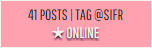 It's really neat that it can be done, and the shorter time I have to look for your @tagged, the better. - A link to the app is generally good. The rest just depends on the type of site. Some sites need money, some sites don't. Some sites need plot pages, some sites don't. Some sites need personal statuses, some sites don't. It all depends. That's my three cents, anyway, everyone's welcome to dispute it if you like. LOL EDIT - I nearly forgot. The site element I thought was so effing cool, I died and wanted it for EVERYTHING.      THIS CODE THAT TIGRIS DID. It inspired me for another project, and I fully plan to tell Tigris what that is if she contacts me. -eyebrow waggle- You can change the colour of those boxes depending on the hex code that you enter, and she's using it as a way to display colours of people's Hues on a Psycho-Pass site. Mega cool. Mega props. |
|
|
|
Post by SEADRA on Mar 22, 2015 10:44:44 GMT -8
the main reason i'm dropping into this thread is because it's sunday, i'm bored, and also procrastinating lmao :'D also i love these types of discussions because everybody has different opinions and i love them. info: i honestly love making my mini profiles personalized to go with the forum (mostly if it's just a one-acc-p-c site) that include clubs, membergroup, magical ability, occupation - pretty much anything that is custom to the site that would be nice to double check with when roleplaying and not have to go to the app of the character. i also like having a link to the app and potentially the plot page of the character, but especially the app - just so you don't have to go milling through pages of bios to find one single character. the bare minimum should be name, membergroup, custom title (if needed), avatar, money (if needed) and maybe a spot for a status. basically what gs has. i feel like if you have too many spots it can kind of be overwhelming and more harmful than good - it's overkill and unnecessary. hovers: yes and no. for resource sites i'm actually biased towards simpler mini profiles with no hover - just because you don't need as much information and idunno - i think it's kind of overkill? on roleplays, however, sometimes i have the opposite view. i like being able to use all the images for my characters (i hoard so many omg pls don't ask) so a hover 200x300 image that shows the vitals is really kind of nice. basically, i'm impartial and whether or not you have them or don't won't effect my view on the site. size: 300px in width maximum, the height can vary (if you're doing a vertical "normal" miniprofile) - but i wouldn't make it any longer than 400px. if you're using large avatars i'd say stick to a 200x300 image, since people already have those and it can be difficult to find larger high res images for some face claims. cool stuff: there hasn't been too much innovation with design of mini profiles, lately there's just been a "standard" mini profile that people normally use so i basically love it when people make them really personal to the theme/genre of the forum, or implement elements from the skin design into the mini profile, and just put effort to making them look different or trying new things. also when they have a really interesting design + when the designer kind of steers away from the boxy element of the profile is really cool. pet peeves: when the hover hides the user's name - the user's name should be visible at ALL TIMES. also when the name isn't the actual link to the profile can get irritating, especially for proboards when the username shows how you tag them. i personally really dislike the mini profiles that just look like this: it's a personal cringe thing for me, idk. it's the kind of thing that makes me want re-code it all for the poor admin (i get the same feeling with not-so-great skins). it's not original, it's standard - i just personally think a little more effort should be put into it. that being said, it's not going to turn me off of a site if the designer does something like this, and it's possible to make this layout look pretty nice! but it's the poor execution and the lack of coding that hurts my designer soul. enjoy: when there's a spot for 100x100 icons it makes me really super happy - i have hoarded all of these 100x100 icons for years and it breaks my heart when i can't use them other than just my application and plotter (i'm usually to lazy for post temps most of the time). i also like really quirky things or interesting hover effects (sometimes it can be overkill but yeh), things that make it unique to the site and the designer, blah blah blah. also using proboard's custom designs to the fullest~~~~ yep. okay, if i think of anything else i'll probably edit it in but that's all i got.
|
|
|
|
Post by Zozma on Mar 31, 2015 20:30:38 GMT -8
I love hover profiles. I just don't like the ones that are all slow to transition. I originally started using them so I could quickly look up things about a character (age and height usually) and I didn't want to have to go around clicking for it. If I have to sit there for two years while the thing shows up, I'm going to throw a table.
I love clearly defined boxes for the information. I don't like the ones with info just floating around without a box. I love having little icons inside the hover. I love having music. I often listen to the theme songs while reading. I love larger avatars. I hate just one 100x100 icon for an avatar. I like them tall. On one site, they are 225x350 and on my other site, they're standard 200x300.
The information I consider a MUST HAVE: number of posts, name of the player playing a character, and a link to the profile in the user name. Most of the other stuff I just enjoy having, like age and height because I look those two things up a lot.
|
|


 Five years ago, the Pokemon League formed Lux to create a new world order of peace and harmony. A rebellion formed, under the name of Nox, cries tyranny at Lux's new microcosmic control. Their civil war now tears the Pokemon world apart. The world hangs in the balance of predormitum. Which side will you choose?
 is a high stakes RP set in a dystopian Russian society recovering from an apocalyptic war between the armies of Heaven and Hell. Greater Russia now stands free from the influence of God and the Devil, and all non-humans run the risk of execution. Outside the safe zones lies the contained wasteland of Moscow, where demons and mutated shadowbeasts continue to terrorize the remaining human survivors who have been penned in with them. As of late, increasing evangelic disturbances threaten the peace that has ruthlessly maintained by the secret police.